wellnessfitpro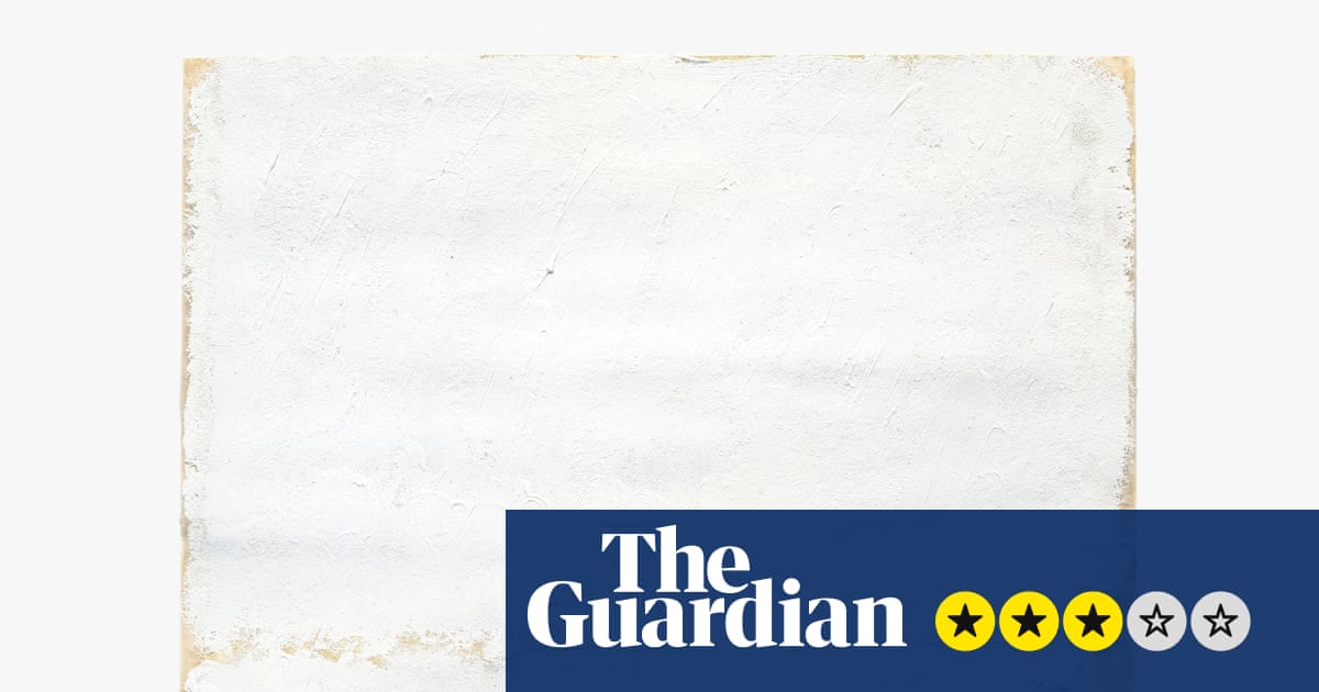
Writing about painting is a futile exercise at the best of times. This is especially the case when, as with Robert Ryman, the paintings in question are variations on the theme of white. If that sounds pretentious – or like a tired joke – then it might also be understood as a reaction against the dependence of so much art on language (which is also to say, bullshit). Because these bare-bones paintings – white paint, a flat surface, wall fixtures – are the “real thing” in the most literal way: they are not trying to tell you a story, they do not require you to be familiar with any abstruse theories. There is just you and the materials, how the paint lies, how it scatters the light. So the question is: how much do you like looking at paint?
Happily for me, given that it is a non-negotiable part of my job, I really like looking at paint. If you also like looking at paint, then there is much in this exhibition that will take your breath away. Take The Painting of the Mysterious Shadow from the mid-60s, after Ryman had left his job as a guard at MoMA, having given up on a career as a jazz musician, and settled into the project that would occupy the rest of his life. Six thick white stripes run horizontally across the canvas, as close to each other as can be managed by a steady hand without overlapping. The fabric is stretched over a deep wooden frame, meaning that its surface sits about three inches off the wall, and casts a thin shadow upon it. That’s your lot.
And it is a lot, if you are willing to go with it. Under this diffuse light, and against the warmer white of the walls, the surface of the painting comes to look grey-bluish. Because the eye adjusts the intensity of a colour by reference to those surrounding it, the previously imperceptible difference between those two shades of paint comes to seem dramatic. When I opened up my notebook to record this effect, I found that its pages, which had been white, were now a ghastly yellow-brown. This is exemplary of how Ryman’s intense focus on a narrow band of perception opens up worlds within it. And if you can sustain the same level of attention through the show, it will offer up revelations.
Because Ryman could do it all, within his tightly circumscribed field. His use of different white paints allows you to focus on how his handling of the material, by turns delicate and heavy handed, rough and precise, changes its effects. The gorgeous scuff of white cloud looks like it would lift the work titled Concert to the ceiling, were it not for the four screws fixing its fibreglass surface so conspicuously to the wall; an untitled 1958 work is slathered in a bilious yellow-white that, in combination with Ryman’s cartoonish signature, conjures a welcome energy. The numinous Surface Veil II stages the meeting of some lavender-tinted atmospherics with a cold front on a monumental scale. Most remarkable of all is the 13-part suite Standard, here installed as an immersive environment that stays just the right side of the forced transcendentalism that so dates the work of some of his peers.
These effects are made possible by the Barbican’s intelligent installation. Recognising that this is a demanding show even for true believers, benches direct viewers to the works most likely to open up under the pressure of their gaze. Refreshingly clear and intelligent texts are removed from the immaculate walls to a well-designed pamphlet. And yet, even as my eye adjusted to the point that I could identify (even revel in) the fractional discrepancies of white that animate these works, the law of diminishing returns began to take effect. And the question at the back of my mind returned to the front: does any of this matter? Is all of this just an exercise in academic connoisseurship?
In defences against that claim, Ryman’s work is vulnerable to what you might call the emperor’s new clothes inverted: namely, that if you present an art historian with a plain piece of white fabric, they will tell you that they have discovered the emperor beneath it. Ryman was not interested in justifying his paintings by grandiose theories, and neither am I. Instead, he chased after an indefinable “wellbeing and rightness” that might be understood as a harmonious arrangement of homogenous elements. Because Ryman’s unframed paintings bleed into the white walls, this rightness comes to be a function of the architectural environment. The gallery resembles heaven as imagined by a 1950s melodrama.
It might be that I am not ready for heaven. Because I came to feel trapped in this controlled space, so thoroughly insulated from the outside world. Neither the crises through which Ryman lived (as the literature notes) nor those of the present can penetrate it. His intense focus on a narrow band of colour might provide a momentary refuge from the stories that are crowding in on our lives. But there is no neutral colour, and no neutral space. In our historical moment, this show feels more like an escape from reality than a confrontation with it.
after newsletter promotion
#Robert #Ryman #review #brain #handle #show #white #paintings #Painting